This week in our newsetter we mentioned we were going to post about putting more affordable art pieces together, which we have found is not always an easy task (making them all work together). So here we hope to share a few tricks, links to ideas on how to hang them, alternative ideas for frames etc. We'll start out with these beautiful encaustic miniature beeswax paintings by South Carolina-based artist,
Katie Runnels. If you visit her shop,
The Constant Gatherer you will find a few of these gems left which, as she shows in the above photo, are adorable as a set. We love how she's hung these in a "gallery style" grouping. What's nice about these too is, no frames are needed, which makes for a nice saving we often forget about when buying art.
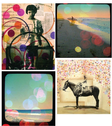
We love these polk-dot-themed prints and photographs grouped together by two etsy artists and
PHM vendors ,
Michelle Caplan (prints) and
Bueller (photographs). These would look great in black
RIBBA frames (there's so many sizes to choose from) and black frames create contrasts and put the focus in the room on your pictures. Or in the extra affordable
CLIPS (frame with clips) from Ikea which look great against a colored wall. Perfect for a girl's (teenager) room or a nice hall grouping for people like us who love horses and surfing!
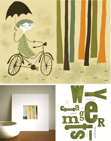
These next three just spoke to each other we thought.
Matte Stephens is such a favorite of ours and this print titled,
Vivienne on her bike has a light humourous feel to it and connects so well we think with the
Learning Curve polaroid collage from
Trampoline and
Talking in Circles letterpress print from
Green Chair Press. These all could be framed in white, light wood or darker frames. But personally we like the idea of white.
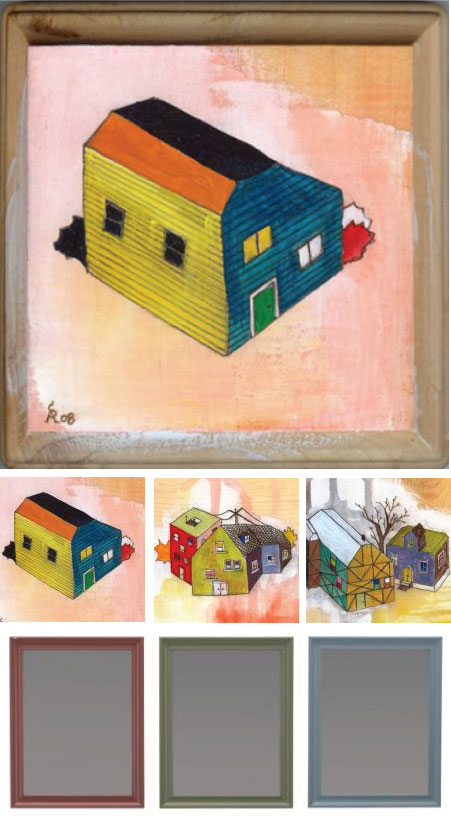
Los Angeles-based artist,
Andrea Shear has such great colors in her
Little Boxes original paintings series which come already included with extended edges of the plaque with hooks, which is such a great feature. Another idea is if you have prints or paintings with similar colors, we love the idea of different colored frames or mattings to compliment them. Ikea has these
Fanaholm frames in assorted colors that would work really well for this idea. A link
here shows a great example of this.
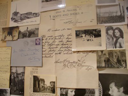
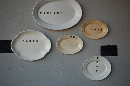
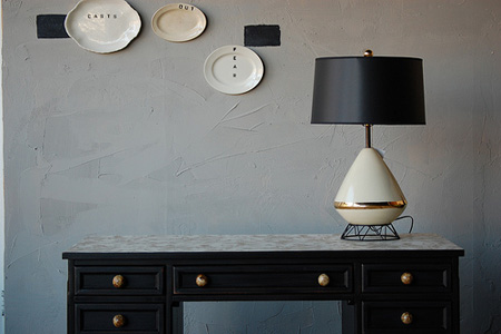
As far as where pictures should be hung. Really it's entirely up to you of course (whatever makes you happy), but if you are cursed (almost is what it feels like at times) like me (and seek advice), we feel pictures need to be hung (not too high) and not too low - although there are exceptions of course anywhere. If I'm visiting a place where the picture is hung too high or it's crooked or unbalanced I feel cursed, where i, it distracts me to the point sometimes that I loose track of my conversations or there's an urge to walk up and straighten it. So for me in my home, I need that balance and preciseness. Not preciseness where I measure, but precise where they are not too high or two low. I think if you're hanging art above furniture for instance they can be hung somewhat lower if they are larger pieces, perhaps starting even just a few inches up from the furniture itself (4 to 5 inches perhaps) above the furniture line is a good place to start if they are desks, credenzas and dressers. And perhaps a bit higher if it's a couch. If they are smaller then it just depends on how many you are placing together. If you have many and it covers a wide area, then you can start lower. It's just all in balance. Writing this, I'm realizing how crazy I am about all this. So with that said, perhaps I've said enough. Just that pictures really shouldn't be hung above your head (when standing) unless you have a gallery style setting and there are pictures at eye level scattered randomly above and below eye level. I suggest you have fun, invite a friend that enjoys this particular activity as much as you (or even more than you) and make a visit out of it. My family always did that, and I suppose that's where all of this stems, it was fun, we all gave our two cents worth and in the end a beautiful display was created. Anyway, hopefully some of this makes sense and is of some help for those that do seek advice. The best advice is I think to try and hang art so it doesn't look too pre-meditated, yet considered.
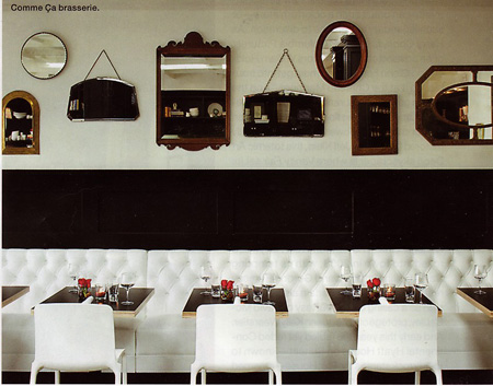
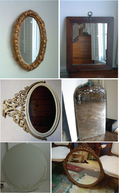
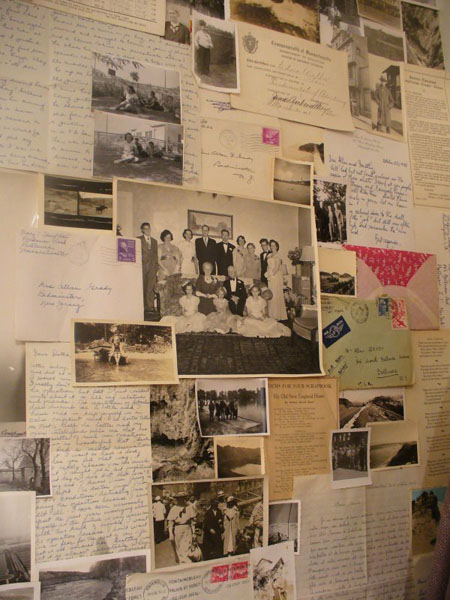
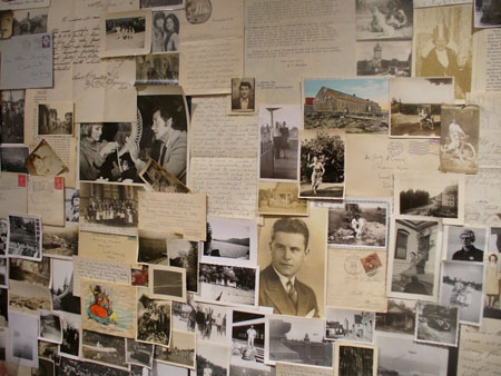
For those of you who don't need the advice I welcome your opinions in the comments, as I love new ideas and ways to hang art (especially affordable ways). Other links about alternative ideas for hanging art that we've posted previously for reference are
Hanging prints using wooden pant hangers,
bull dog clips and check out
The Art of the Display posts we've done as well as catch some inspiration from our
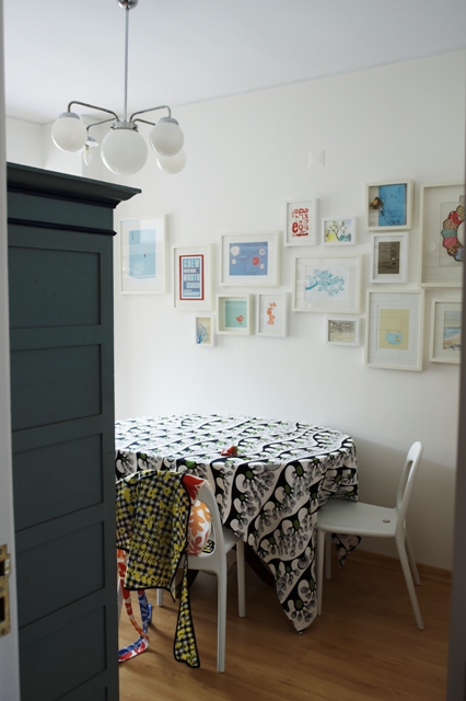
The Art of the Display flickr group where we found this great display below by
Saidos da Concha.
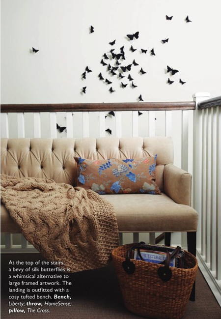 From the April '09 issue of Canadian House and Home. Photo by Janis Nicolay and designed by HGTV's Take it Outside host, Kelly Deck.
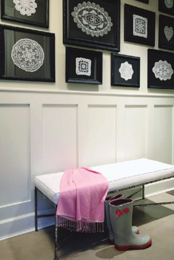 From the April '09 issue of Canadian House and Home. Photo by Janis Nicolay and designed by HGTV's Take it Outside host, Kelly Deck.
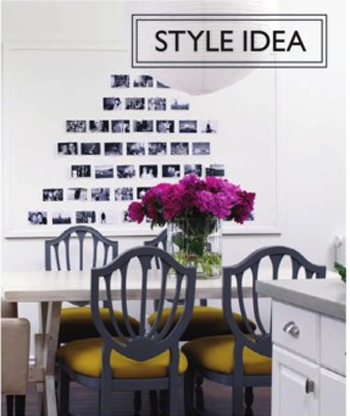 Photo by Donna Griffith. Canadian House and Home Style Editor, Stacey Smithers created this idea by turning some black and white photo's into a piece of art by painting a framed corkboard white.
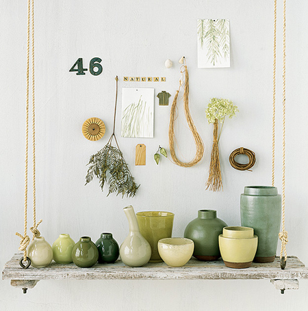 Christine Rudolph via graphic-exchange.com. A beautiful display of various green things that just seem to be related to each other in one way or another.
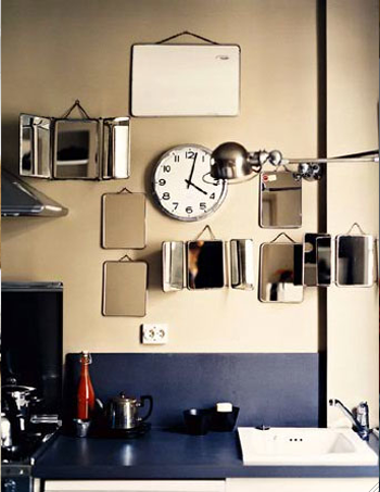 Ditte Isager via graphic-exchange.com. The use of those mini bathroom mirrors, pulled into a kitchen location and hung about, seem so out of place yet in place.